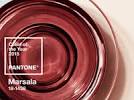
 Let’s hear it for Marsala, (PANTONE 18-1438), the wine-influenced, red-kissed color of 2015! Pantone’s yearly picks herald a marked presence of a color in fashion, beauty, housewares, home and industrial design and consumer packaging, though some years the influence is stronger than others.
The 2014 color of the year was Radiant Orchid, a deep tropical purple. The year before that it was Emerald green and in 2012 a tangerine/orange hue was the color of choice. All of these had a very strong presence and could be overpowering, and a bit difficult to use as “the main event” for most of my clients. Those who loved these colors incorporated them into their accessories rather than their primary furniture.
Hardy and robust but not too bold, Marsala however, is in my opinion, much more user friendly as an anchor color for any room. Just like the color of marsala wine, this shade is very grounded – much like an earth tone because it is a red with both brown and blue undertones that will work beautifully in furniture and flooring applications. And, it can be easily combined with other colors – I absolutely love it with camels and beiges and in smaller doses with the grays and greens.
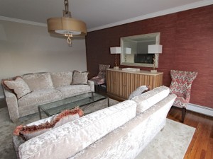
 I actually have a client who loves this color and we already used it as an accent for her walls. A marsala colored grasscloth, with sparkle and tones of gold running through it, complemented the neutral fabrics we picked for her furniture and worked well with corals and other warm shades. Clearly, we were ahead of the curve and this Westchester County interior designer loved using marsala for a wall application as it hardly swallowed the entire room.


